PRINCIPLES OF GESTALT When I was researching for an image that would contain principles of Gestalt, it was very difficult. I think I put every phrase from "gestalt principles" to " gestalt art" in the Google search box. I did not understand why I was not coming up with anything until I came out of your class last week. You had told us that no artist sits before he begins a work and says, " I think I will put a Gestalt principle here, and maybe here." It doesn't work like that. An artist puts Gestalt principles in their art because they are trained too. They don't plan it out, it comes natural.
So then I Googled art in the search box instead and looked for it instead. I immediately got this image which has a good variety of the principles of Gestalt. In this piece, the first principle that I see is containment. With the two trees with a dark value on both side of the paper. Their branches reach up and around the top of the artwork; therefor keeping your eye contained in the piece.
The second principle that I spot is proximity between the branches of the trees to the house in the background. I feel like the branches are reaching towards the house. The distance between the two elements creates a visual unity, and leads your eye around.
The third principle that I noticed is grouping. I automatically group the yellow-white flowers on the right, left, and then in the background together. This mainly because it is the only yellow on the page, and also the brightest colors on the page compared to the dark-values on the tree and the hues on the house in the background.
Lastly, I see repetition in many ways in this piece of work. The trees are repeated on the left, right, and in the background. The flowers as individual elements create a sense of repetition that leads your eye back to the house, the main focus. The windows are also repeated. I try to imagine the home with only one window. To me, the home would not be very aesthetic, and therefore the artist added more windows.
Thursday, September 28, 2006
Thursday, September 21, 2006
Image Essay #7
CLOSURE: CHUCK CLOSE
Chuck Close's paintings send me up the roof and if you do not know who Chuck Close is then you better read this blog and visit his website! The first time I heard of his name, I didn't think he was anything special. But once I traveled to the Toledo Musum of Art and acutally stood in front of one of his paintings up CLOSE, my thoughts about his art changed. You are speechless when you study each one of the boxes in his paintings. Chuck Close grids his artwork into squares. He individualy paints each square with dull or vibrant colors( each square can contains more than ten colors) to reach the tone he wants.
Chuck Close's paintings are labor-intensive and time-consuming, and his prints are more so. While a painting can occupy Close for months, it is not unusual for one print to take upward of two years to complete, from conception to final edition. And with few exceptions - separating the Mylars for silk screens or carving the woodblocks - Close insists on a decidedly interactive and "hands-on" approach to the creation of his prints. He carves linoleum blocks, draws on and applies acid to his etching plates, and personally directs all the intricate handwork involved in pulp-paper multiples. He also revels in his collaboration with master printers: "Like any corporation, I have the benefit of the brainpower of everyone who is working for me. It all ends up being my work, the corporate me, but everyone extends ideas and comes up with suggestions."
I welcome everyone to check out his website and his incredible pieces of art.
http://www.chuckclose.coe.uh.edu/index.html
Image Essay #4
PRINCPLES OF GESTALT
Before an artist begins a piece of artwork, there are many things he or she considers. One of them are the Principles of Design. They are given names such as unity and variety, contrast, emphasis, balance, movement, repetition and rhythm, and economy. The principles of design are used by artists to organize the so-called visual elements(lines, tones, shapes, textures, and colors) into a unified drawing fore an artist begins a piece of artwork, there are many things he or she considers. One of them are the Principle of Design. They are given names such as unity and variety, contrast, emphasis, balance, movement, repetition and rhythm, and economy. The principles of design are used by artists to organize the so-called visual elements(lines, tones, shapes, textures, and colors) into a unified drawing.
The second thing that an artist considers before starting a piece of work are the Principles of Gestalt. Gestalt is the configuration of elements so unified as a whole that its properties cannot be derived from a simple summation of its parts. There are six Principles of Gestalt. One is grouping. You naturally group elements by position, orientation, shape, and value. Second is containment which means when elements are enclosed or contained by the paper line or other elements on the page. Thirdly is repetition which is a pattern of elements. Fourth is proximity which is the distance between elements that increases visual unity. Fifth is continuity which is the the fluid connection among compositional parts. Lastly, is closure, which is when various specially formed or cut out bricks in an artwork that contains elements in themselves also.
In this piece by Malcolm Harding, unity and variety is prominent. The many shapes of color keep your eye on the piece, especially the random blue circles. Harding created unity not only by using mellow, soft colors like pink, yellows, reds, and oranges, but by his grid-making through out the whole artwork. The grid unifies every element so that it appears on one plane. This art piece contains many Principles of Gestalt. The first that I see is grouping. I naturally group the two pink circles together, and then the yellow circular elements. Secondly I see repetition in the background. Harding uses grid work to create a repetition of squares that takes your eye back into space. Lastly, I see continuity. Yellow shapes have a fluid connection among each other. They make your eye flow from one yellow, oval, element to the next one.
Tuesday, September 19, 2006
Image Essay #5
David Salle's paintings of the 1980's were shocking in the best sense: not because of their images or subject matter, though some critics objected to the possibly demeaning depictions of women, but because they could look so bad and yet be so weirdly exciting and so promising of new possibilities for a medium that many people were not ready to take on. His juxtaposition, details, and illogical compositions gave his paints a mystery and charge that intrigued the art world then and now.
When David Salle emerged in art, his work was set squarely within the critical definition of post-modernism by its art-historical references and ambiguous combinations of original and appropriated imagery from artistic traditions such as Pop Art, Minimalism, Abstract Expressionism, Cubism, and Realism as well as images from popular culture. Salle’s pictures leave the viewer to develop meaning out of layered images and surrealistic disjunctions. His artwork includes erotically charged representations of nude women borrowed from pornographic magazines, quotations from ThĂ©odore GĂ©ricault’s paintings of corpses, and actual pieces of furniture affixed to the canvas. Mediums people have used before, but not in one piece of work. That is why I believe that this image is an above average image. Salle forced meaning into his artwork, that then forced meaning into people’s minds. No one really knew what Salle meant by any of his works, but left it to the audience.
Salle's imagery and the unique manner in which he drew from a variety of sources sets his painting apart from the work by other artists clamoring for public and critical attention. Salle often combined the figure with abstract forms and this juxtaposition typically resulted in a mode of painting that was at once accessible and unfamiliar. He differed from any artist in that his paintings were introspective, enigmatic, often brooding and vaguely disturbing meditations on the contemporary world and our desperate search for meaning. In a society fixated on images and image making, Salle presented us with an unsettling mirror of our own existence.
Monday, September 18, 2006
Blog Assignment #3
Before this Blog Assignment, had you ever kept a journal, diary, or blog? Yes, I had to keep a journal in my studio art class in high school. Along with sketches, we also had to include ideas on art work that we had for future purposes in our art carear. i have kepy a blog journal online before, but it was about personal experiences. I rarely wrote about art.
Before this Blog Assignment, had you ever written about art before? I have rarely written about art till now.
Have you ever written for fun (poetry, fiction or non, journalistic, or research)? Through out teenage years, I often wrote poetry or journal entries about life.
When writing, do you use a dictionary or thesaurus? I use both a Dictionary and Thesaurus in my writings so that my work is more exciting to read.
If given a chance, would you rather discuss art verbally or through written means? I would rather discuss art through written means because I think you can write what you think better than discuss what you are thinking,
How would you rate your overall vocabulary? I belive I have an above average vocabulary.
How would you rate your vocabulary of art terminology? I know I am above average when it comes to art terminology.
How would you rate your writing abilities? I am confident.
How would you rate your writing abilities when writing about art?I am very confident.
How would you rate your ability to use specific vocabulary when writing? I rate myself above average.
Tuesday, September 12, 2006
Image Essay #3
DEPTH Depth is a term used to describe a three-dimensional quality on a two-dimensional surface. Giving your layout depth can help make your design more interesting and eye-catching. It can also make your design seem more solid, giving the elements dimension and space rather than a "floating" quality.
There are many way to give depth to your art work. Lets take M.C. Escher’s Hand with Sphere Ball for example. In Escher’s piece, he first creates depth simply by perspective. Everything is three-dimensional on the two-dimensional paper. His use of value in shading gives the illusion of a three-dimensional.
Secondly, Escher meets depth by shrinking sizes. Using our common knowledge of object sizes is another great way to trick the brain into sensing distance. Since we all know approximately how big a person is, for example, when you see the self-portrait of Escher sitting in the chair, we assume there is a great amount of space between the window and himself. We know the person is bigger than the window, therefore creating implied space.
Thirdly, one of the simplest and most direct ways to create a sense of distance in art is to include a leading line. Lines work best when they start near the front edge of the image and go to the far horizon and conclude at a single point. In this piece, there is not a direct line of perspective, but there are many implied lines that lead you from the “ front” of the piece to the “ back.” For example, the line on the top of the bookshelf begins in the front and leads your eye back towards the window. Or even the lines of the carpet on the bottom take your eye back, therefore creating perspective and depth.
Lastly, Escher uses overlapping. You can see in the sphere, the chairs are overlapping each other, and even the books on the shelving are overlapping. By juxtaposing images by each other, varying in size and value, it creates depth immediately.
Saturday, September 02, 2006
Blog Assignment #2
When composing my composition there was many things to put into consideration. You can’t just scatter any image you want on a piece of paper. You have to go through steps of drawing out thumbnails and considering things like balance, dominate elements, subordinate elements, accentual elements, accentual groups, negative space, positive space, and much more.
One main thing I looked at when I was putting together my composition was the dominance in size of an element. The bigger the image, the more prominent it is, and the more meaning it will have over, for example, an accentual image. The larger images are more powerful, and you need to be careful where you place it. You don’t want to place it to where it is taking over the whole paper, or that will be the only thing the element will look at. You want the viewer to look at the whole piece, and keep movement going throughout the piece.
The second thing I considered while juxtaposing images are value and shape inside of the elements. On my composition, I have a black eight ball. If I were to place it on the left side of the paper, I need to be sure to put, for example, two smaller black images on the right in order to keep balance in my artwork. Also, when I was making my first draft of my composition, I had a dice. You have to keep in mind congregated groups of accentual shapes. Shapes inside of each element can lead the viewers eye in a direction as well. You don’t want to take the viewer off the page.
Image Essay #2
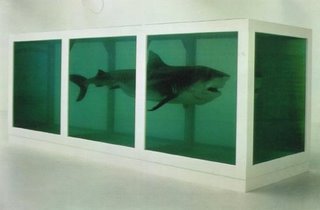
When I learned about the artist Damien Hirst in class this week I was so astonished that I went back to my dorm and researched him. Not only has he created the famous killer shark named The Physical Possibility of Death in the Mind of Someone Living [ the above image] , but other well known “freeze” artworks as well. They include In and Out of Love, an installation for which he filled a gallery with hundreds of live tropical butterflies, some spawned from monochrome canvases on the wall; Away from the Flock, a lonely, single sheep, and many more. Hirst has become very well known not just because of his paintings, but because of his theme of death and variety of media. When Hirst’s shark sculpture came out in 1991, many art critics argued weather or not it was art. They argued that it was not art because you could not understand it unless you had an art degree. I beg to differ.
But lets explore Hirst’s The Physical Possibility of Death in the Mind of Someone Living a little bit more. The shark is suspended in formaldehyde, sleek, deadly, and – of course – dead. It didn't look dead, though: it looked as though it was alive, suspended somehow not only in space but in time. It looked as though it could come alive any moment. Walking around it, staring at it staring at you, you felt in real physical danger. The shark is part of Hirst’s Natural History series, in which dead animals (such a sheep or a cow) are preserved, sometimes cut-up, in formaldehyde. The sale of the 18 foot shark in 2004 made Damien Hirst the second most expenisive living artist after Jasper Johns.
So how did Hirst come up with this deadly artwork? I took some time to look up his biography on the internet. Damien Hirst was born in Bristol, and grew up in Leeds. His father was a motor mechanic/car salesman, who left the family when Hirst was 12. His mother, Mary, was a lapsed Catholic, who worked for the Citizens Advice Bureau and says she lost control of him when he was young. He was arrested on two occasions for shoplifting. However, Hirst sees her as someone who would not tolerate rebellion: she cut up his punk bondage trousers and heated one of his Sex Pistols vinyl records on the cooker to turn it into a fruit bowl. He says, "If she didn't like how I was dressed, she would quickly take me away from the bus stop." She did, though, encourage his liking for drawing, which was his only successful educational subject.
His art teacher "pleaded" for Hirst to be allowed to enter the sixth form, where he took two A-levels, achieving an "E" grade in art. He went to Leeds College of Art and Design, although the first time he applied he was refused admission. He worked for two years on London building sites, then studied Fine Art at Goldsmith's College, University of London , although again he was refused a place the first time he applied. While a student, Hirst had a placement at a mortuary, an experience that influenced his later themes and materials.
Subscribe to:
Posts (Atom)