Thursday, December 07, 2006

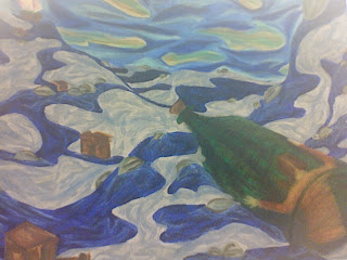
Rabbit Down the Hole: Self Portrait

BEING DROPPED OFF AT COLLEGE I knew after 2D Foundations class critique yesterday that I really need to put some more work into my piece. I wanted to be done so bad with this piece that I kind of shrugged it away. I knew the boxes needed more work because they looked more like brown spots in the water, and that the water had no depth because of the way it hit the sky. I was having a lot of trouble drawing the bottle in a foreshortening style from the beginning, but yet I failed to go get visual reference for it. So, because of my laziness, I paid for it in class. When Anthony Fontana asked the class which ones stood out, mine defiantly didn't get mentioned. It was like a blow to my heart. I was so stunned that I barely said anything during critique, which I knew I should have. Every time I wanted to say something, I just stayed quiet. My mind kept playing back to mid-term reviews when Anthony told me that I need to participate more in critiques. I knew that I needed to do something to make it innovative, gripping, and memorable.

Everything that I knew needed work on was mentioned in the critique. The boxes need more lighter values to define the edges so they have that cardboard look. The hard edges will also place some tension against the soft, wavy water. The bottle needs to be round on the top like the bottom of the bottle so it looks as if its pointing away from you. To create depth in the water, I need to put some darker values on the water that is suppose to be farthest away. I also need to have the sky get darker as it meets the sky so that it looks more open than flat. I thought it was a cool idea when Anthony showed me how to put line of color in the water to create some movement. But he was right when he said I put so much in there, that I ended up with the same monotone water as I had before. I need to add strategically placed values into the water to create some variety.

This project has not only taught me to take everything that I learned and pull into a piece of work, but it has also opened my eyes to not just shrugging off projects. Just because I put a lot of hours into a piece, does not mean it is going to pay off. It is how efficiently you use those hours that depends on if those all nighters paid off or not.

Down the Rabbit Hole: Self Idenity Statement

I believe as a student here at Bowling Green State University for six months I have changed as I portray myself as an individual and as a student. The face that you enter this college environment where no knows who you are or where you are from only advocates the changed that have occurred. As an individual, I believe I am more outgoing; I can introduce myself to people without wondering what they think of me. I am also more acceptable of people, such as different cultures, races, personalities, and other things. I am less judgmental. I feel like I have grown more as a student though. My ambition to become more confident in my work has made me a better art student. I take fellow students' and professors' critical evaluations more seriously. I look ahead of the consequences of falling behind more often to keep me motivated. The choices to become an person and student drive me to become all I can be.

Image Essay #15

PRIMARY COLORS Big Red by Daniel S. Jiménez is a perfect example of the primary color ( red, blue, and yellow) scheme being used in a piece of work. The most red is being used in the main focal point which is the apples, then in the middle ground in the curtains, and then lastly in the background curtains again. Yellow is being used in all the grounds, being in the curtains and basket, and blue is being used in the curtains, which drape from the background to the foreground.
This artist made sure that the primary color scheme is being used in all the grounds to create unity in the piece. It allows our eye to begin in the foreground and end in the background. This allows us to keep our eye on the piece rather than just glancing at it and moving on. This artist also uses really dark shades and high tints to create more visual interest. He uses a pure white highlight on the apples, and even some on the currents. He uses very dark shades for the shadows of the curtains and underneath the table to create a space of variety in the piece.

Image Essay #14

KHYA: MONOCHROMATIC ART Khya from Belgium is a 30 year old graphic designer who is trying hard to become a jewelry designer. But it is not just her fine, hand crafted jewelry made of moonstone, pearls, and silver that catches my eye, but her theme of monochromatic art in her two-dimensional works. Monochromatic means having one color or hue. Monochromatic works of art are limited to a palette of light and dark shades of one single color.

In this piece, which is currently untitled, Khya uses a red monochromatic background which eventually spreads it way up to the figure in the foreground. The use of the monochrome style in the background allows the foreground element to pop out more, while still having some sort of movement in the background.

This piece is very interesting to look at because of only a few colors are being used in this piece. If it were colored to look realistic, it would not give off the same mood and meaning. What colors you use in a piece, whether it be, analogous, triadic, or complimentary plays a big role on how you and viewers interpret a piece of work.

Sunday, November 26, 2006

Image Essay #13

GLENN BROWN: COLOR Glenn Brown is an English artist from London whose paintings is finely crafted and often comments on other paintings, copying them but with a twist. Moving from the sweet to the sickly sweet, Glenn Brown makes photo-realistic paintings by mixing together reproductions of other artists' work. From a distance Brown's version appears identical, but on closer inspection is revealed to be painted completely different. There was some controversy over his exhibition at the 2000 Turner Prize, as the artist Tony Roberts closely based one of the paintings on a science-fiction illustration Double Star produced in 1973. This gave rise to a charge of plagiarism. Brown eventually settled the resulting legal action out of court.

I chose this artist because his unique but yet controversial style of painting interests me the most. I believe the reason why we have today’s pieces of art is because something from past artist has inspired us. I believe that early artists inspire Glenn Brown, but he does not copy them.

Brown presents large, meticulously wrought oils inspired by sci-fi imagery and paintings by Salvador Dali and Frank Auerbach. Some critics refer to Brown as an appropriation artist, and he has faced copyright infringement litigation mounted by a number of detractors ranging from pulp novel illustrators to the Dali Foundation. The London-based artist's interpretations of earlier artworks, however, are wildly imaginative. Using a painstaking technique with nearly imperceptible brushwork, ultra-slick surfaces and a witty play on scale and color.

Tuesday, November 14, 2006

Image Essay #12


PIET MONDRIAN Piet Mondrian is a Dutch painter, who carried abstraction to its limits. Through radical simplification of composition and color, he sought to expose the basic principles that underlie all appearances. He developed "neoplastic" aesthetic involving reduction of paintings to elements of straight lines, primary colors, noncolors. Mondrian created a new style called Neoplasticism, based on some of the ideas of the cubists. He created a series of almost identical geometric paintings based on a theory of universal harmony. Neoplasticism is the theory and practice of the de Stijl group, chiefly characterized by an emphasis on the formal structure of a work of art, and restriction of spatial or linear relations to vertical and horizontal movements as well as restriction of the artist's palette to black, white, and the primary colors.

Mondrian’s goal was to eliminate all traces of representation in favor of balanced compositions of primary color and vertical and horizontal lines. His belief that a canvas—a plane surface—should contain only planar elements led to his abolition of all curved lines in favor of straight lines and right angles. In other words, Neoplasticism represents the absolute elements—primary colors and vertical and horizontal lines—that underlie all appearances. He used vertical and horizontal lines to show that the canvas was a place consisting of right angles. His achievement of balance between unequal parts affected the direction of art, architecture, and industrial design.

In this piece named, Composition with Red, Black, Blue, Yellow and Grey, Neoplasticism is defintly at work. The painting includes straight, grey lines, and the primary colors red, blue, and yellow. The straight lines only create geometric shapes, and no curve lines are present in this piece. This is an above average example because it contains all the pieces that make up a piece of Neoplasticism work of art.

Image Essay #11

ANDY WARHOL Warhol is best known for his silk-screen prints of packaged consumer products, everyday objects, such as Campbell's Soup Cans, poppy flowers, and the banana appearing on the cover of the rock music album The Velvet Underground and Nico , and also for his stylized portraits of twentieth-century celebrity icons, such as Marilyn Monroe, Elvis Presley, Jacqueline Kennedy Onassis, Judy Garland, and Elizabeth Taylor.When he started painting, he wanted to find a target for himself. At the time Pop Art, as it was later named, was already an experimental form. Warhol turned to this new style where popular subjects could be part of the artist's vocabulary. His early paintings show images taken from cartoons and advertisements, hand-painted with added paint drips. He added these drips to give his paintings a seriousness by emulating the style of the abstract expressionists that were en vogue at the time. He wanted to be taken seriously or to sell his paintings.

Not only is Andy Warhol well-known for the elements he paints, but how he creates them. Warhol’s use of photo silkscreen is creative because it is a technique traditionally used for mass production for commercial purposes. Photo silkscreen is a printmaking technique that allowed Warhol to repeat images over and over. It contains many layers of rubber glaze and paint. Warhol used photo silkscreen to create some of his most famous works of art. On the website of http://webexhibits.org/colorart/marilyns.html, I listened to a tape recording of an interview with Andy Warhol. He says the reason why he uses artificial colors ( colors that are mixed and are not realistic to the element being painted) because he does not know how to paint realistically. He also says that he tries mixing a flesh tone, but never seems to get the right one. Warhol’s stylistic painting makes his artwork memorable and creative. He may not be the best realsitic painter, but he sure is the best pop culture painter.