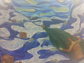
BEING DROPPED OFF AT COLLEGE I knew after 2D Foundations class critique yesterday that I really need to put some more work into my piece. I wanted to be done so bad with this piece that I kind of shrugged it away. I knew the boxes needed more work because they looked more like brown spots in the water, and that the water had no depth because of the way it hit the sky. I was having a lot of trouble drawing the bottle in a foreshortening style from the beginning, but yet I failed to go get visual reference for it. So, because of my laziness, I paid for it in class. When Anthony Fontana asked the class which ones stood out, mine defiantly didn't get mentioned. It was like a blow to my heart. I was so stunned that I barely said anything during critique, which I knew I should have. Every time I wanted to say something, I just stayed quiet. My mind kept playing back to mid-term reviews when Anthony told me that I need to participate more in critiques. I knew that I needed to do something to make it innovative, gripping, and memorable.
Everything that I knew needed work on was mentioned in the critique. The boxes need more lighter values to define the edges so they have that cardboard look. The hard edges will also place some tension against the soft, wavy water. The bottle needs to be round on the top like the bottom of the bottle so it looks as if its pointing away from you. To create depth in the water, I need to put some darker values on the water that is suppose to be farthest away. I also need to have the sky get darker as it meets the sky so that it looks more open than flat. I thought it was a cool idea when Anthony showed me how to put line of color in the water to create some movement. But he was right when he said I put so much in there, that I ended up with the same monotone water as I had before. I need to add strategically placed values into the water to create some variety.
This project has not only taught me to take everything that I learned and pull into a piece of work, but it has also opened my eyes to not just shrugging off projects. Just because I put a lot of hours into a piece, does not mean it is going to pay off. It is how efficiently you use those hours that depends on if those all nighters paid off or not.
Thursday, December 07, 2006
Down the Rabbit Hole: Self Idenity Statement
I believe as a student here at Bowling Green State University for six months I have changed as I portray myself as an individual and as a student. The face that you enter this college environment where no knows who you are or where you are from only advocates the changed that have occurred. As an individual, I believe I am more outgoing; I can introduce myself to people without wondering what they think of me. I am also more acceptable of people, such as different cultures, races, personalities, and other things. I am less judgmental. I feel like I have grown more as a student though. My ambition to become more confident in my work has made me a better art student. I take fellow students' and professors' critical evaluations more seriously. I look ahead of the consequences of falling behind more often to keep me motivated. The choices to become an person and student drive me to become all I can be.
Image Essay #15
PRIMARY COLORS Big Red by Daniel S. Jiménez is a perfect example of the primary color ( red, blue, and yellow) scheme being used in a piece of work. The most red is being used in the main focal point which is the apples, then in the middle ground in the curtains, and then lastly in the background curtains again. Yellow is being used in all the grounds, being in the curtains and basket, and blue is being used in the curtains, which drape from the background to the foreground.
This artist made sure that the primary color scheme is being used in all the grounds to create unity in the piece. It allows our eye to begin in the foreground and end in the background. This allows us to keep our eye on the piece rather than just glancing at it and moving on. This artist also uses really dark shades and high tints to create more visual interest. He uses a pure white highlight on the apples, and even some on the currents. He uses very dark shades for the shadows of the curtains and underneath the table to create a space of variety in the piece.
Image Essay #14
KHYA: MONOCHROMATIC ART Khya from Belgium is a 30 year old graphic designer who is trying hard to become a jewelry designer. But it is not just her fine, hand crafted jewelry made of moonstone, pearls, and silver that catches my eye, but her theme of monochromatic art in her two-dimensional works. Monochromatic means having one color or hue. Monochromatic works of art are limited to a palette of light and dark shades of one single color.
In this piece, which is currently untitled, Khya uses a red monochromatic background which eventually spreads it way up to the figure in the foreground. The use of the monochrome style in the background allows the foreground element to pop out more, while still having some sort of movement in the background.
This piece is very interesting to look at because of only a few colors are being used in this piece. If it were colored to look realistic, it would not give off the same mood and meaning. What colors you use in a piece, whether it be, analogous, triadic, or complimentary plays a big role on how you and viewers interpret a piece of work.
Sunday, November 26, 2006
Image Essay #13
GLENN BROWN: COLOR Glenn Brown is an English artist from London whose paintings is finely crafted and often comments on other paintings, copying them but with a twist. Moving from the sweet to the sickly sweet, Glenn Brown makes photo-realistic paintings by mixing together reproductions of other artists' work. From a distance Brown's version appears identical, but on closer inspection is revealed to be painted completely different. There was some controversy over his exhibition at the 2000 Turner Prize, as the artist Tony Roberts closely based one of the paintings on a science-fiction illustration Double Star produced in 1973. This gave rise to a charge of plagiarism. Brown eventually settled the resulting legal action out of court.
I chose this artist because his unique but yet controversial style of painting interests me the most. I believe the reason why we have today’s pieces of art is because something from past artist has inspired us. I believe that early artists inspire Glenn Brown, but he does not copy them.
Brown presents large, meticulously wrought oils inspired by sci-fi imagery and paintings by Salvador Dali and Frank Auerbach. Some critics refer to Brown as an appropriation artist, and he has faced copyright infringement litigation mounted by a number of detractors ranging from pulp novel illustrators to the Dali Foundation. The London-based artist's interpretations of earlier artworks, however, are wildly imaginative. Using a painstaking technique with nearly imperceptible brushwork, ultra-slick surfaces and a witty play on scale and color.
Tuesday, November 14, 2006
Image Essay #12
PIET MONDRIAN Piet Mondrian is a Dutch painter, who carried abstraction to its limits. Through radical simplification of composition and color, he sought to expose the basic principles that underlie all appearances. He developed "neoplastic" aesthetic involving reduction of paintings to elements of straight lines, primary colors, noncolors. Mondrian created a new style called Neoplasticism, based on some of the ideas of the cubists. He created a series of almost identical geometric paintings based on a theory of universal harmony. Neoplasticism is the theory and practice of the de Stijl group, chiefly characterized by an emphasis on the formal structure of a work of art, and restriction of spatial or linear relations to vertical and horizontal movements as well as restriction of the artist's palette to black, white, and the primary colors.
Mondrian’s goal was to eliminate all traces of representation in favor of balanced compositions of primary color and vertical and horizontal lines. His belief that a canvas—a plane surface—should contain only planar elements led to his abolition of all curved lines in favor of straight lines and right angles. In other words, Neoplasticism represents the absolute elements—primary colors and vertical and horizontal lines—that underlie all appearances. He used vertical and horizontal lines to show that the canvas was a place consisting of right angles. His achievement of balance between unequal parts affected the direction of art, architecture, and industrial design.
In this piece named, Composition with Red, Black, Blue, Yellow and Grey, Neoplasticism is defintly at work. The painting includes straight, grey lines, and the primary colors red, blue, and yellow. The straight lines only create geometric shapes, and no curve lines are present in this piece. This is an above average example because it contains all the pieces that make up a piece of Neoplasticism work of art.
Image Essay #11
ANDY WARHOL Warhol is best known for his silk-screen prints of packaged consumer products, everyday objects, such as Campbell's Soup Cans, poppy flowers, and the banana appearing on the cover of the rock music album The Velvet Underground and Nico , and also for his stylized portraits of twentieth-century celebrity icons, such as Marilyn Monroe, Elvis Presley, Jacqueline Kennedy Onassis, Judy Garland, and Elizabeth Taylor.When he started painting, he wanted to find a target for himself. At the time Pop Art, as it was later named, was already an experimental form. Warhol turned to this new style where popular subjects could be part of the artist's vocabulary. His early paintings show images taken from cartoons and advertisements, hand-painted with added paint drips. He added these drips to give his paintings a seriousness by emulating the style of the abstract expressionists that were en vogue at the time. He wanted to be taken seriously or to sell his paintings.
Not only is Andy Warhol well-known for the elements he paints, but how he creates them. Warhol’s use of photo silkscreen is creative because it is a technique traditionally used for mass production for commercial purposes. Photo silkscreen is a printmaking technique that allowed Warhol to repeat images over and over. It contains many layers of rubber glaze and paint. Warhol used photo silkscreen to create some of his most famous works of art. On the website of http://webexhibits.org/colorart/marilyns.html, I listened to a tape recording of an interview with Andy Warhol. He says the reason why he uses artificial colors ( colors that are mixed and are not realistic to the element being painted) because he does not know how to paint realistically. He also says that he tries mixing a flesh tone, but never seems to get the right one. Warhol’s stylistic painting makes his artwork memorable and creative. He may not be the best realsitic painter, but he sure is the best pop culture painter.
Thursday, November 02, 2006
Image Essay #10
CHIAROSCURO Chiaroscuro is an important artistic term meaning "light/dark". It implies the deep contrast between light and shadow that gives a sense of drama and tension to a painting. Chiaroscuro helps strengthen the illusion of depth on a two-dimensional surface, and was an important topic among the artists of the Renaissance. The father of chiaroscuro was Michelangelo Merisi da Caravaggio. Caravaggio brought this technique to a whole new level, creating an atmosphere of extreme tension by his intense contrasts. After Caravaggio, this became an important feature of Baroque art and was emulated in particular in the many "Caravaggio schools" which were born all over Italy.
This painting by Caravaggio is the best example of the usage of chiaroscuro. The main focus is the main in the center. We know this because he has the brightest value, white, on him. The figures around the man are also painted with a “shadow” of light, but none as bright as the man in the middle. The background negative space is shaded with a dark value. This makes a good contrast between the figures and background. When chiaroscuro is used in this painting, it seems as if there is a window on the left hand side, but we know in fact that there is not because of the background and space around the figures,
Thursday, October 19, 2006
Image Essay #9
M.C. Escher was master of figure ground reversal. Figure ground reversal creates another kind of force, the positive and negative shapes fight for attention. What happens is that, when joined, each shape competes with the other. One is at first relegated to mere background and is hardly seen, while the other dominates as an object. Then the reverse happens: the object fades perceptually away to become for a time mere background in its turn.
This piece by M.C. Escher is an above average example of figure ground. The white birds seem to be flying out of the white checkers and the background sky. But if you look at the black birds, they also seem to be coming out of the floor and sky also. The figure ground reversal is very evident in here because the birds are suppose to be in the foreground, but make there way to the background. When the figure and ground are equally well designed, every square inch of the image becomes engaged. It makes the piece more aesthetic pleasing to the viewer.
Blog Assignment #5: SUE COE
SUE COE Even though Sue Coe is not in education, she has contribute greatly to my field of study. She makes uncompromising demands. She demands to speak freely. She demands viewers go eye-to-eye with the equivalent of road kill. She demands unflinching openness in full view of painful contradictions. Coe opens up the areas of art that were not okay to teach, for example, when my parents were in school. Back then, people with an "open mind" were considered going against religion and society. Sue Coe helped to cut those strings, and open up the mind to new ideas that are now okay to draw and teach.
Sue Coe stands out in this field because she dedicates her art to influencing individuals to change the world. The subjects she has focused on include animal rights, the meat industry, racism, apartheid, the AIDS crisis, the Ku Klux Klan, and rape. Coe's work is also directed at oppressive working conditions. She creates politcal artwork that maybe not everone will agree with at times.
The thing that impressed me most about Sue Coe is her confidence. Sue Coe is a keen observer, a 'graphic witness' to realities more often overlooked or avoided. She created art based on subjects that she felt were not being adequately addressed by conventional news organizations. She was brave enough to contribute to each subject argument with her art.
Glancing at Coe’s work, she uses dominance in a unique way. Her elements seem to all come together to make one big element, therefore, being the dominant element. At first I did not understand why, but then I can see that she is trying to send a message. If she would make one thing bigger than the other, it may give off the message that one is more important than the other. Coe believes that each subject she uses is all important.
I have been very influencd not only by Sue Coe’s work, but her spunk also. I need to be more confiedent in my art work, even if I know it might cause controversies sometimes. I need to take more risks in my art, so that people remember who I am because of my risks. She creates artwork that isn't easily forgotten. That's her goal. She's spent decades depicting cruelties and foibles--not to shock but to educate, influence and, she hopes, inspire change.
Sue Coe may use rape, war, and death for her subjects, but her art pieces are colored with bright blues, greens, yellows, reds, and more. She uses emphasis on color. The irony that the viewer does not want to look at the piece beacause of the horrific subject, but Coe uses bright colors so that you almost HAVE to look at it. She also uses sketchier lines to address the human form. It makes the people look not so realistic therefor giving off the sense that the scene was made up.
Tuesday, October 17, 2006
Blog Assignment #4: Stories
STORIES:
1.Some important stories that are told in society today and will be passed on our national and local tragedies, and history. Some national examples are the 9/11 attacks, the holocaust, the Columbine school shooting, Pearl Harbor, and the war with Iraq. I can guarantee that the story about the holocaust will be passed down to future generations because the massive genocide was one of the biggest in history, and it did not happen too long ago. The stories from the Jews on their journeys to the concentration camps are horrifying to think that they actually true. The way they were treated and how may died is unforgettable.
2.I think some stories are told, as opposed to others because it depends on the people it involves and in what country. Usually the stories are retold because they are tragedies, and no one can forget the details. For example, I can remember the bad things President Bush did while in office, but I can’t remember any good. A lot of times also, stories are overlapped by each other. If more than one story or event happens in the same period of time, then the “greater” one would obviously be remembered better than the other. That is how stories are lost; other things happen that are more interesting.
3.The artists in Stories use sketchbooks in their artistic processes for many reasons. Richard Stare used a sketchbook to keep the eye and hand coordinated with each other. The eye is a muscle, the more you use it the better it will be able to see. Kiki Smith uses a journal to sketch her inside ideas. You first have to think inside what your idea is, and sketch that idea into physical form. It is a way to think. I believe sketchbooks are works of art because they contain your ideas that make your final piece of work. You make a rough draft before you write the final to your paper. So a sketchbook is a rough draft of your final piece of artwork.
4. I woke up early this morning because Dad needed help in the field. I still think 6 A.M. is way to early for a kid trying to enjoy their summer. I am usually awake when most of my friends are still sleeping, and I feel that I am missing my childhood. After I get out of the field about 2, I am going to take a shower, and then go play in the creek with Emily. She and I are making a secrete club house. We are going to eat the vegetables out of the field for food, sleep in the tree house, and bathe in the creek. That would be so much fun if it were real, but I guess we can keep on imagining it instead. I feel really tired right now. I wish I could sleep in one day. But I work Monday through Friday, wake up Saturday for the farmer’s market at 5:45 A.M., and then Sunday morning for church. Thats my life in one sentence. I wake up every morning wishing it was school time, that way I don’t have to work in the hot sun. I think that is why I love school so much.
Looking back at myself at age 15, I can see I was very hardworking for my age. I had been helping my dad every single day during the hot summer, while most people my age were taking trips to the beach or Cedar Point. I see that growing up, my childhood was filled with work instead of play, and when I did play, I used my imagination to feel that it was real. When I first realized this, I was kind of upset and mad that my family’s farm stole my childhood away, but then I realize that it made me who I was today. I am full of creativity and imagination that shows in my art today. I can use my experiences of my farm life in my artwork, that no one else can use or tell. I can only thank my father now for dragging me out of bed so early.
Blog Assignment #4: Place
ARTL: 21-PLACE
1. Do we define a place or does a place define us? I believe a place defines us. Places are jumping off points for our imagination. Environments provide refuge and inspiration for many artists. Places are what begins the piece of artwork, and makes it what it is. We work around the environment, the environment does not work around us.
2. How is each of the featured artists influenced by particular places? How is this influence reflected in the artist's work?
RICHARD SERRA: Serra creates sculptures shape and stretch steel like rubber, carving intimate moments out of public spaces. He invents a new way of posing elements. He enjoys the engagement between his sculptures and the viewer. "I was surprised that people who had absolutely no information about sculpture were able to enter into these pieces," says the Serra "The experience for them was fulfilling because, in some sense, it was startling, it was new, because they couldn't locate themselves." Serra's pieces are bug enough for crowds of people to be inside them, and not look out of them. These realizes the theme of not knowing where they are at.
SALLY MANN: The farm where Mann lives and works becomes a meaningful place as her inspired process of capturing it by photography. Mann was greatly inspired with Southern farm life, sensory, clothing, her children, and anything natural. A basic dog bone has become her focus for many of her photographs. She films them in ways and direct lighting that make the dog bone more meaningful.
MARGARET KILGALLEN: Kilgallen uses place more literally than the other artists. She focuses on her artwork on the place you are when you view it. She spends a lot of time trying to perfect her line work. When you are close up to her work you can see the line waver, but when you stand far away the line looks straight. This makes the artwork more beautiful to her.
BARRY MCGEE: McGee focus most of his art on urban inspirations by graffiti. Local train yards and outside places is where he is inspired most. He is amazed at the history of some of the graffiti on the train because each person who painted that has a histoy of there own also. When McGee paints inside he feels his art is contained by only certain viewers. If he paints outside, is limited to only people of the world.
PEPON OSORI: In Osori's work he is influenced by his Puerto Rican heritage and experience as a social worker inform his staged confrontations between public life and private spaces. He believes if you can not come into one of his rooms( his art), then you must at least reflect on it.
3. How has the program altered your notion of how art expresses a place? I have always felt we define a place till I watched this program. I thought we as artists influenced a place and made it what it is. But now that I look deeper I see that the place actually defines our art and defines us. The place was there before we were, it is only fair to let it define us.
4. Which artist do feel most connected to and why? I feel mostly connected with Sally Mann because she cradles farm life into her artwork. With me being born and raised on a farm all my life, I really connected with her photography of her children playing in the creek and the items such as the dog bone.
5. Compare the media used by each artist and discuss how it affects the scale, composition, and accessibility of his or her work. With RICHARD SERRA's work, he uses steel beams for his media. This allows him to make his sculptures as big or small that he wants, and bend the steel anyway that believes. His usage of huge beams allows the viewers to walk inside his pieces, allowing them to be part of the piece as well. SALLY MANN uses media that is around her such as her children, dog bones, or the lake in her photography. Photography allows her to make the viewer see things different ways by manipulate with the light. BARRY MCGEE's media of graffiti allows him to work in spaces that you aren't normally suppose to paint on such as trains and brick walls. With it being outside, anyone is accessible for everyone to view. Lastly, PEPON OSORI uses walk-in rooms and everyday items for his media. It allows people to feel as if they were actually there when they walk in it, and if they can’t walk in it, they should stop and reflect upon it.
6. When you were young, was there a place that interested you? List five places from your childhood and use one word to describe them.
a. creek: thinking
b. field: isolation
c. woods: exploration
d.playground: creativity
e. barns: scared
7.What objects occupy one place? huge trees, creek, poison ivy. weeds, wild flowers and strawberries, leaves, deer, birds, tadpoles, turtles, crawfish, tunnels, pathway
What are the textures and sizes of these objects? rough trees that are broken in piles, and holes in them, crunchy leaves, slimy mud
What was the lighting like? light through top of trees and reflection off of water, it was a happy place where you could forget all the worries in your life and just have fun
Sunday, October 15, 2006
Image Essay #8
VALUE IN ART
Value is the lightening to darkness of a color. We use value to create three-dimensional objects on a two-dimensional plane. Without value, the world would be flat, our bodies would be paper thin, and our artwork bleak and static. Painters will use Values to create a sense of space and form in their paintings. Having different Values give a work of art interest The viewer will look at a work of art longer if it contains elements that that will invite the human eye to look and excite their vision.
In this charcoal piece by Lita Dawn, she uses value to achieve realism and depth in space. It seems as though you are really watching a women sitting down on a bench reading. The bench looks so real that you could actually sit on that bench. If you glance at the value from the bench closest to you, and then follow your eye to the back where the building you should notice the value gets progressively darker. Artists use this technique to achieve depth and illusion of space within the piece. Quick changes from light to dark values are used to create texture such as the rocks on the ground, and the bark on the tree. Lastly, darker or lighter values are used to show an illusion of color. If you look at the trash bags in the trash cans, they are shaded very dark creating a sense of the color black. The light shade of value on the benches give a sense of the color white or maybe yellow to the benches.
Thursday, September 28, 2006
Image Essay #6
PRINCIPLES OF GESTALT When I was researching for an image that would contain principles of Gestalt, it was very difficult. I think I put every phrase from "gestalt principles" to " gestalt art" in the Google search box. I did not understand why I was not coming up with anything until I came out of your class last week. You had told us that no artist sits before he begins a work and says, " I think I will put a Gestalt principle here, and maybe here." It doesn't work like that. An artist puts Gestalt principles in their art because they are trained too. They don't plan it out, it comes natural.
So then I Googled art in the search box instead and looked for it instead. I immediately got this image which has a good variety of the principles of Gestalt. In this piece, the first principle that I see is containment. With the two trees with a dark value on both side of the paper. Their branches reach up and around the top of the artwork; therefor keeping your eye contained in the piece.
The second principle that I spot is proximity between the branches of the trees to the house in the background. I feel like the branches are reaching towards the house. The distance between the two elements creates a visual unity, and leads your eye around.
The third principle that I noticed is grouping. I automatically group the yellow-white flowers on the right, left, and then in the background together. This mainly because it is the only yellow on the page, and also the brightest colors on the page compared to the dark-values on the tree and the hues on the house in the background.
Lastly, I see repetition in many ways in this piece of work. The trees are repeated on the left, right, and in the background. The flowers as individual elements create a sense of repetition that leads your eye back to the house, the main focus. The windows are also repeated. I try to imagine the home with only one window. To me, the home would not be very aesthetic, and therefore the artist added more windows.
Thursday, September 21, 2006
Image Essay #7
CLOSURE: CHUCK CLOSE
Chuck Close's paintings send me up the roof and if you do not know who Chuck Close is then you better read this blog and visit his website! The first time I heard of his name, I didn't think he was anything special. But once I traveled to the Toledo Musum of Art and acutally stood in front of one of his paintings up CLOSE, my thoughts about his art changed. You are speechless when you study each one of the boxes in his paintings. Chuck Close grids his artwork into squares. He individualy paints each square with dull or vibrant colors( each square can contains more than ten colors) to reach the tone he wants.
Chuck Close's paintings are labor-intensive and time-consuming, and his prints are more so. While a painting can occupy Close for months, it is not unusual for one print to take upward of two years to complete, from conception to final edition. And with few exceptions - separating the Mylars for silk screens or carving the woodblocks - Close insists on a decidedly interactive and "hands-on" approach to the creation of his prints. He carves linoleum blocks, draws on and applies acid to his etching plates, and personally directs all the intricate handwork involved in pulp-paper multiples. He also revels in his collaboration with master printers: "Like any corporation, I have the benefit of the brainpower of everyone who is working for me. It all ends up being my work, the corporate me, but everyone extends ideas and comes up with suggestions."
I welcome everyone to check out his website and his incredible pieces of art.
http://www.chuckclose.coe.uh.edu/index.html
Image Essay #4
PRINCPLES OF GESTALT
Before an artist begins a piece of artwork, there are many things he or she considers. One of them are the Principles of Design. They are given names such as unity and variety, contrast, emphasis, balance, movement, repetition and rhythm, and economy. The principles of design are used by artists to organize the so-called visual elements(lines, tones, shapes, textures, and colors) into a unified drawing fore an artist begins a piece of artwork, there are many things he or she considers. One of them are the Principle of Design. They are given names such as unity and variety, contrast, emphasis, balance, movement, repetition and rhythm, and economy. The principles of design are used by artists to organize the so-called visual elements(lines, tones, shapes, textures, and colors) into a unified drawing.
The second thing that an artist considers before starting a piece of work are the Principles of Gestalt. Gestalt is the configuration of elements so unified as a whole that its properties cannot be derived from a simple summation of its parts. There are six Principles of Gestalt. One is grouping. You naturally group elements by position, orientation, shape, and value. Second is containment which means when elements are enclosed or contained by the paper line or other elements on the page. Thirdly is repetition which is a pattern of elements. Fourth is proximity which is the distance between elements that increases visual unity. Fifth is continuity which is the the fluid connection among compositional parts. Lastly, is closure, which is when various specially formed or cut out bricks in an artwork that contains elements in themselves also.
In this piece by Malcolm Harding, unity and variety is prominent. The many shapes of color keep your eye on the piece, especially the random blue circles. Harding created unity not only by using mellow, soft colors like pink, yellows, reds, and oranges, but by his grid-making through out the whole artwork. The grid unifies every element so that it appears on one plane. This art piece contains many Principles of Gestalt. The first that I see is grouping. I naturally group the two pink circles together, and then the yellow circular elements. Secondly I see repetition in the background. Harding uses grid work to create a repetition of squares that takes your eye back into space. Lastly, I see continuity. Yellow shapes have a fluid connection among each other. They make your eye flow from one yellow, oval, element to the next one.
Tuesday, September 19, 2006
Image Essay #5
David Salle's paintings of the 1980's were shocking in the best sense: not because of their images or subject matter, though some critics objected to the possibly demeaning depictions of women, but because they could look so bad and yet be so weirdly exciting and so promising of new possibilities for a medium that many people were not ready to take on. His juxtaposition, details, and illogical compositions gave his paints a mystery and charge that intrigued the art world then and now.
When David Salle emerged in art, his work was set squarely within the critical definition of post-modernism by its art-historical references and ambiguous combinations of original and appropriated imagery from artistic traditions such as Pop Art, Minimalism, Abstract Expressionism, Cubism, and Realism as well as images from popular culture. Salle’s pictures leave the viewer to develop meaning out of layered images and surrealistic disjunctions. His artwork includes erotically charged representations of nude women borrowed from pornographic magazines, quotations from Théodore Géricault’s paintings of corpses, and actual pieces of furniture affixed to the canvas. Mediums people have used before, but not in one piece of work. That is why I believe that this image is an above average image. Salle forced meaning into his artwork, that then forced meaning into people’s minds. No one really knew what Salle meant by any of his works, but left it to the audience.
Salle's imagery and the unique manner in which he drew from a variety of sources sets his painting apart from the work by other artists clamoring for public and critical attention. Salle often combined the figure with abstract forms and this juxtaposition typically resulted in a mode of painting that was at once accessible and unfamiliar. He differed from any artist in that his paintings were introspective, enigmatic, often brooding and vaguely disturbing meditations on the contemporary world and our desperate search for meaning. In a society fixated on images and image making, Salle presented us with an unsettling mirror of our own existence.
Monday, September 18, 2006
Blog Assignment #3
Before this Blog Assignment, had you ever kept a journal, diary, or blog? Yes, I had to keep a journal in my studio art class in high school. Along with sketches, we also had to include ideas on art work that we had for future purposes in our art carear. i have kepy a blog journal online before, but it was about personal experiences. I rarely wrote about art.
Before this Blog Assignment, had you ever written about art before? I have rarely written about art till now.
Have you ever written for fun (poetry, fiction or non, journalistic, or research)? Through out teenage years, I often wrote poetry or journal entries about life.
When writing, do you use a dictionary or thesaurus? I use both a Dictionary and Thesaurus in my writings so that my work is more exciting to read.
If given a chance, would you rather discuss art verbally or through written means? I would rather discuss art through written means because I think you can write what you think better than discuss what you are thinking,
How would you rate your overall vocabulary? I belive I have an above average vocabulary.
How would you rate your vocabulary of art terminology? I know I am above average when it comes to art terminology.
How would you rate your writing abilities? I am confident.
How would you rate your writing abilities when writing about art?I am very confident.
How would you rate your ability to use specific vocabulary when writing? I rate myself above average.
Tuesday, September 12, 2006
Image Essay #3
DEPTH Depth is a term used to describe a three-dimensional quality on a two-dimensional surface. Giving your layout depth can help make your design more interesting and eye-catching. It can also make your design seem more solid, giving the elements dimension and space rather than a "floating" quality.
There are many way to give depth to your art work. Lets take M.C. Escher’s Hand with Sphere Ball for example. In Escher’s piece, he first creates depth simply by perspective. Everything is three-dimensional on the two-dimensional paper. His use of value in shading gives the illusion of a three-dimensional.
Secondly, Escher meets depth by shrinking sizes. Using our common knowledge of object sizes is another great way to trick the brain into sensing distance. Since we all know approximately how big a person is, for example, when you see the self-portrait of Escher sitting in the chair, we assume there is a great amount of space between the window and himself. We know the person is bigger than the window, therefore creating implied space.
Thirdly, one of the simplest and most direct ways to create a sense of distance in art is to include a leading line. Lines work best when they start near the front edge of the image and go to the far horizon and conclude at a single point. In this piece, there is not a direct line of perspective, but there are many implied lines that lead you from the “ front” of the piece to the “ back.” For example, the line on the top of the bookshelf begins in the front and leads your eye back towards the window. Or even the lines of the carpet on the bottom take your eye back, therefore creating perspective and depth.
Lastly, Escher uses overlapping. You can see in the sphere, the chairs are overlapping each other, and even the books on the shelving are overlapping. By juxtaposing images by each other, varying in size and value, it creates depth immediately.
Saturday, September 02, 2006
Blog Assignment #2
When composing my composition there was many things to put into consideration. You can’t just scatter any image you want on a piece of paper. You have to go through steps of drawing out thumbnails and considering things like balance, dominate elements, subordinate elements, accentual elements, accentual groups, negative space, positive space, and much more.
One main thing I looked at when I was putting together my composition was the dominance in size of an element. The bigger the image, the more prominent it is, and the more meaning it will have over, for example, an accentual image. The larger images are more powerful, and you need to be careful where you place it. You don’t want to place it to where it is taking over the whole paper, or that will be the only thing the element will look at. You want the viewer to look at the whole piece, and keep movement going throughout the piece.
The second thing I considered while juxtaposing images are value and shape inside of the elements. On my composition, I have a black eight ball. If I were to place it on the left side of the paper, I need to be sure to put, for example, two smaller black images on the right in order to keep balance in my artwork. Also, when I was making my first draft of my composition, I had a dice. You have to keep in mind congregated groups of accentual shapes. Shapes inside of each element can lead the viewers eye in a direction as well. You don’t want to take the viewer off the page.
Image Essay #2
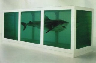
When I learned about the artist Damien Hirst in class this week I was so astonished that I went back to my dorm and researched him. Not only has he created the famous killer shark named The Physical Possibility of Death in the Mind of Someone Living [ the above image] , but other well known “freeze” artworks as well. They include In and Out of Love, an installation for which he filled a gallery with hundreds of live tropical butterflies, some spawned from monochrome canvases on the wall; Away from the Flock, a lonely, single sheep, and many more. Hirst has become very well known not just because of his paintings, but because of his theme of death and variety of media. When Hirst’s shark sculpture came out in 1991, many art critics argued weather or not it was art. They argued that it was not art because you could not understand it unless you had an art degree. I beg to differ.
But lets explore Hirst’s The Physical Possibility of Death in the Mind of Someone Living a little bit more. The shark is suspended in formaldehyde, sleek, deadly, and – of course – dead. It didn't look dead, though: it looked as though it was alive, suspended somehow not only in space but in time. It looked as though it could come alive any moment. Walking around it, staring at it staring at you, you felt in real physical danger. The shark is part of Hirst’s Natural History series, in which dead animals (such a sheep or a cow) are preserved, sometimes cut-up, in formaldehyde. The sale of the 18 foot shark in 2004 made Damien Hirst the second most expenisive living artist after Jasper Johns.
So how did Hirst come up with this deadly artwork? I took some time to look up his biography on the internet. Damien Hirst was born in Bristol, and grew up in Leeds. His father was a motor mechanic/car salesman, who left the family when Hirst was 12. His mother, Mary, was a lapsed Catholic, who worked for the Citizens Advice Bureau and says she lost control of him when he was young. He was arrested on two occasions for shoplifting. However, Hirst sees her as someone who would not tolerate rebellion: she cut up his punk bondage trousers and heated one of his Sex Pistols vinyl records on the cooker to turn it into a fruit bowl. He says, "If she didn't like how I was dressed, she would quickly take me away from the bus stop." She did, though, encourage his liking for drawing, which was his only successful educational subject.
His art teacher "pleaded" for Hirst to be allowed to enter the sixth form, where he took two A-levels, achieving an "E" grade in art. He went to Leeds College of Art and Design, although the first time he applied he was refused admission. He worked for two years on London building sites, then studied Fine Art at Goldsmith's College, University of London , although again he was refused a place the first time he applied. While a student, Hirst had a placement at a mortuary, an experience that influenced his later themes and materials.
Thursday, August 31, 2006
IMAGE ESSAY #1
MOVEMENT Visual movement is used by artists to direct the scanning behavior of the eye along a path within an artwork. This path leads the viewer to areas of visual interest, focus, or emphasis. An artist arranges parts of an image to create a sense of motion by using lines, shapes, forms, and textures, or by combining elements of art to produce the look of action. For example, if you glance at a mug or cup, the first thing you look at is the handle. Why? Because the only major movement on the cup is the handle, and your eyes are trained to follow the curves along the handle. Through shape, by scaling the size of shapes, an artist creates movement.
Not only does line put an impact on movement in a piece of art work but so does color, value, texture, volume, and shape. It’s hard to imagine anything visual without the use of one or more of these elements. Let’s take a famous piece of art work for example. In Starry Night by Vincent van Gogh, the artwork is full of principles of design. Van Gogh uses strokes(lines) to form movement in the sky, buildings, and everything in the painting. Can you image this painting, if it were painted without strokes? It defintly wouldn’t be as appealing as it is now. Now, lets look at the color and value. Van Gogh used bright yellows, whites, blues, and many other colors to define the strokes which then define the buildings from the sky. If the painting were painted in one color, for example, black , you wouldn’t be able to depict any movement or anything else in the painting. Movement brings the line, color, value, texture, volume, and shape alive.
BLOG ASSIGNMENT #1
As I sit and ponder on what I should write for my first blog, only one thing comes my mind: art. I think the most asked questions that people ask when I tell them that I want to be an art teacher is, “ What made you choose art, and what do you hope to achieve once you get a degree?” Well, I finally have answers to your questions.
The day I wanted to teach art, was the best day of my life. I was at the Toledo Art Museum and I was walking around this quiet, boring museum. I despised art museums as a kid, because you had to go into this small room and you could not touch anything. I walked up to this painting that looked like the artist had just threw paint on it and called it art.
I pondered at it for a moment and said to my sister, “ Who calls this art? It is just a bunch of brush marks everywhere. It does not look like anything! I could do this!”
My older sister quickly replied to me, “ Every piece of artwork in this building was painted, sculpted, or designed for weeks, maybe even months. Every brush stroke on this painting was put there for a reason.”
When I first heard my sister, who is now a graphic designer, I did not believe her. It was not till I went home and I got out my cheap watercolor paints, that I figured out that I could not do that same piece of artwork. That is when it hit me; I wanted to spread that same message to kids.
With a bachelors degree in Art Education I hope to learn many new things to add to my knowledge of art, and discover techniques to help me teach students of many ages to the best of my ability. Once I have achieved a degree, I hope to attain a teaching job where I can expand children's awareness of the variety of artistic expressions, to acquaint them with many different kinds of media used, to teach them the techniques of the visual arts, and to help students gain taste and critical evaluation in art. I hope to open children's eyes and show them that it is not some big picture on a wall; it is art.
Subscribe to:
Posts (Atom)